Jump to content

Welcome to Geeks to Go - Register now for FREE

Need help with your computer or device? Want to learn new tech skills? You're in the right place!
Geeks to Go is a friendly community of tech experts who can solve any problem you have. Just create a free account and post your question. Our volunteers will reply quickly and guide you through the steps. Don't let tech troubles stop you. Join Geeks to Go now and get the support you need!

How it Works Create Account
Photo

Local Church Website


  • Please log in to reply

#1
tiroshii

tiroshii

    Member

  • Member
  • PipPipPip
  • 423 posts
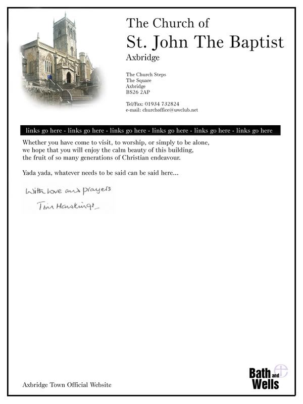
I have been asked to rebuild the website for my local church, I just drafted up a quick and simple idea. I was aiming to make it very simplistic.

I was hoping for any views, improvements etc.

(Yes I know some things need to be moved around a bit, and there is a lot missing. This is just a shell/master page.)

Also, the border is intended to be part of the website.

Posted Image

Edited by tiroshii, 13 January 2008 - 05:12 PM.

  • 0

Advertisements


#2
hiloh2o

hiloh2o

    Member

  • Member
  • PipPip
  • 47 posts
I think it looks great for a front page. Its simple like you said but gets the point across. You may do different headers on your other pages that have to do with the different ministries and that will make it look more interactive, but I think its a great page :) I like the boarder too. It looks like a note or invitation from the church (which I believe the church would like). Im not sure what professional designers would say, but I think that not fallowing the rules sometimes gives you an advantage because it dosnt look like everyone elses page.
  • 0


Similar Topics

0 user(s) are reading this topic

0 members, 0 guests, 0 anonymous users

As Featured On:

Microsoft Yahoo BBC MSN PC Magazine Washington Post HP