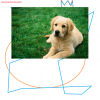
So, I made this recently and would love to know what you guys think about them on what can be improved or what you like about it.. It is basically a web design.

Edited by bnguyen100, 17 June 2014 - 06:47 PM.

Need help with your computer or device? Want to learn new tech skills? You're in the right place!
Geeks to Go is a friendly community of tech experts who can solve any problem you have. Just create a free account and post your question. Our volunteers will reply quickly and guide you through the steps. Don't let tech troubles stop you. Join Geeks to Go now and get the support you need!


Member

So, I made this recently and would love to know what you guys think about them on what can be improved or what you like about it.. It is basically a web design.
Edited by bnguyen100, 17 June 2014 - 06:47 PM.

Member

The green in the preview section in my opinion is too bright, and almost feels out of place. The green is a nice touch for the icons/text etc, but as a background colour I dont feel it works too well.
If the image above is all meant to be just one page, I'd probably remove the green, and try possibly a slightly darker shade of grey from the section above, so as to not blend in with the dashboard grey. There's too many colours on the page. But apart from that I like it very much. A working website would be great to see.
Member

guys, I have a question , what do u think about grass background for me site? http://sport-7.net/.
or is it too typical?
Member
Can't find out your image here. So no comments.


0 members, 0 guests, 0 anonymous users


Community Forum Software by IP.Board
Licensed to: Geeks to Go, Inc.

 Sign In
 Create Account
