I used Notepad++ with this, including Microsoft Paint to edit the container image.
What could be improved? What do you think of the colour scheme?
Thanks.
(I've scanned the file for viruses and it is clear.)

Need help with your computer or device? Want to learn new tech skills? You're in the right place!
Geeks to Go is a friendly community of tech experts who can solve any problem you have. Just create a free account and post your question. Our volunteers will reply quickly and guide you through the steps. Don't let tech troubles stop you. Join Geeks to Go now and get the support you need!


Member


Je suis Napoléon!
Member
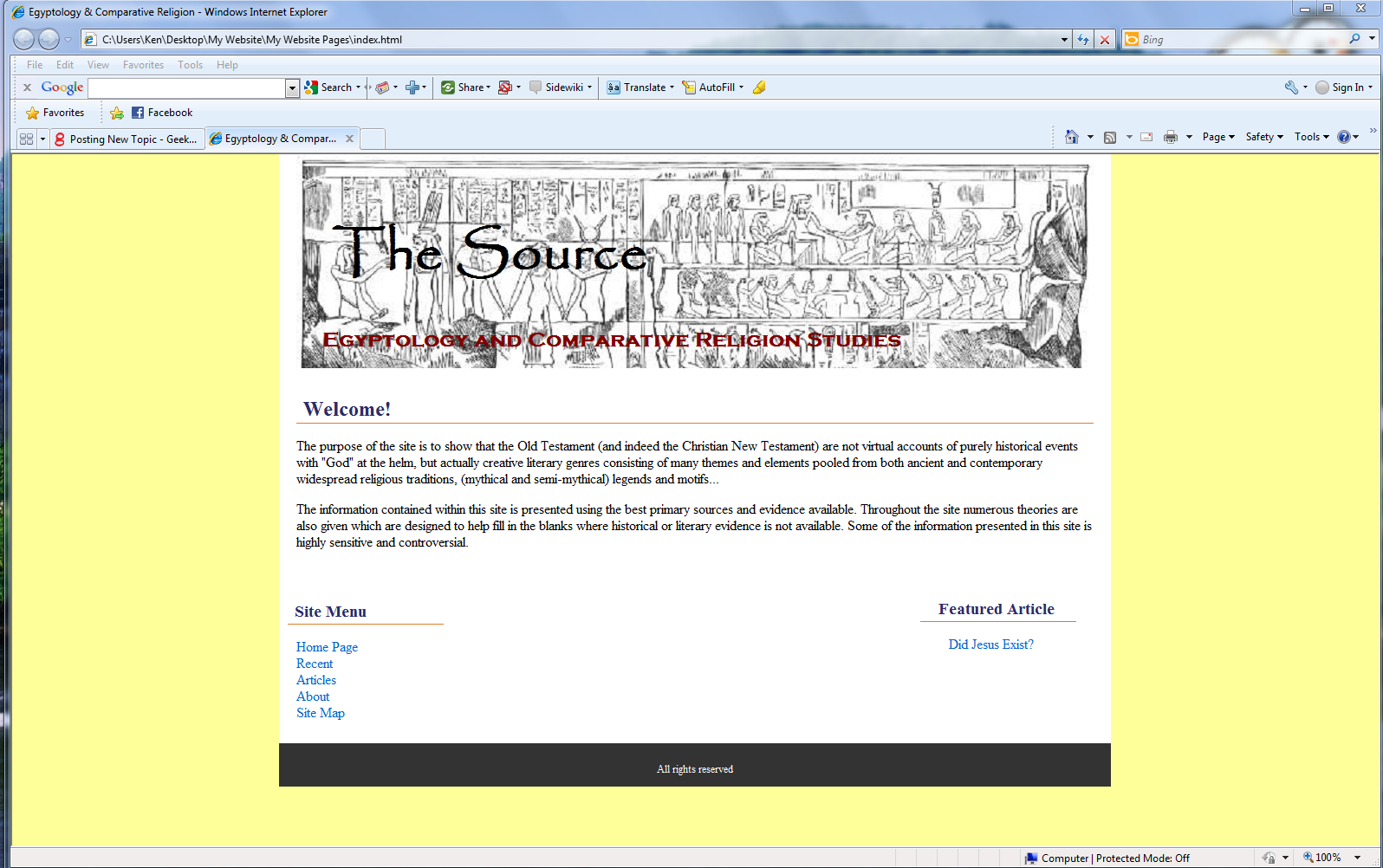
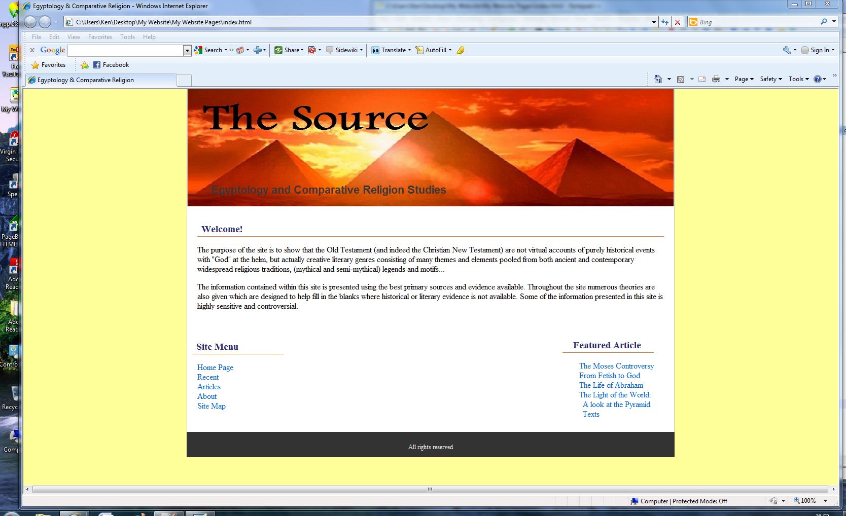
the red text in the header gets washed out pretty quickly by the busy image. you can read it but it's kind of annoying
also, as a general design rule of thumb, even if you're talking about egypt, you should never use papyrus (the font) for anything......ever....at all
Member
the red text in the header gets washed out pretty quickly by the busy image. you can read it but it's kind of annoying
also, as a general design rule of thumb, even if you're talking about egypt, you should never use papyrus (the font) for anything......ever....at all
Je suis Napoléon!
Member
you could use the red text, if it wasn't directly in front of that busy image, or if it was on top of something else that's over the image that doesn't clash.
basically you shouldn't have text directly over a busy patern like that, no matter what color. it's distracting
papyrus is basically the second most hated typeface on the internet (after comic sans)
Je suis Napoléon!
New Member


0 members, 1 guests, 0 anonymous users


Community Forum Software by IP.Board
Licensed to: Geeks to Go, Inc.

 Sign In
 Create Account
